Your website’s colour palette does more than make it look attractive — it shapes how visitors feel about your brand, influences their decisions, and even affects conversion rates. In fact, studies show that people form a first impression of your website within seconds, and much of that impression is based on colour.
Choosing the right colour palette can transform your website from average to memorable. In this guide, we’ll walk you through how to select the best colour palette for your website design — one that reflects your brand personality, improves user experience, and helps you achieve your business goals.
Why Your Website Colour Palette Matters
Your website’s colours are more than just decoration — they’re part of your brand’s visual identity. The right palette communicates professionalism, builds trust, and evokes emotion before a visitor reads a single word.
Here’s how colour influences how users perceive your site:
- Blue = Trust and professionalism (perfect for financial, corporate, or technology websites)
- Green = Balance, growth, and health (great for eco-friendly brands or wellness businesses)
- Red = Excitement and urgency (commonly used in sales, entertainment, and food industries)
Think of your colour palette as a silent storyteller. It sets the tone for how visitors engage with your content and determines whether they stay or leave.
Understanding Colour Psychology in Web Design
Colour psychology is the study of how colours influence perception and behaviour. When used strategically, colour can guide user actions — from encouraging them to click a button to helping them feel more connected to your brand.
Here’s a quick breakdown of how common colours are perceived:
- Yellow → Positivity and energy
- Purple → Creativity and imagination
- Black → Luxury and sophistication
- White → Simplicity and clarity
Your brand personality should be the foundation of your colour choices. A law firm, for example, may lean towards dark blues and greys to communicate trust, while a creative agency might choose bold, energetic tones to reflect innovation.
How to Build a Colour Palette for Website Design
Building the perfect website colour palette isn’t about picking random shades — it’s about creating balance, harmony, and purpose. Here’s how to get it right.
1. Start with Your Brand Colour
Your primary brand colour is your anchor. It’s often taken from your logo and represents your business’s identity.
By starting here, you ensure consistency across all marketing materials — from your website and social media to printed brochures. Consistency reinforces brand recognition, which builds trust and familiarity with your audience.
2. Add Secondary and Accent Colours
Once you’ve defined your main colour, add 2–3 complementary colours. These will help define the look and feel of your site without overwhelming users.
Follow the 60–30–10 rule:
- 60% → Primary colour (dominant background or brand tone)
- 30% → Secondary colour (used for headers, sections, or highlights)
- 10% → Accent colour (for call-to-action buttons or icons)
This ratio creates a visual hierarchy that naturally draws attention to important elements — such as “Contact Us” or “Get a Quote” buttons.
3. Ensure Readability and Accessibility
Good design isn’t just about style — it’s about function. Contrast plays a crucial role in making your website accessible to everyone.
Use dark text on light backgrounds (or the reverse) to ensure readability. Low contrast can frustrate visitors and drive them away.
To check your site’s accessibility, use tools like:
These platforms help you maintain proper contrast ratios that meet WCAG accessibility standards, ensuring your site is inclusive and easy to navigate.
4. Test Colours Across Devices
Colours can look different across screens due to varying resolutions and brightness levels. A bright coral on your desktop might appear orange on mobile.
Always test your colour palette across multiple devices — desktop, tablet, and smartphone — to ensure consistency. A unified appearance builds trust and gives your brand a polished, professional look.
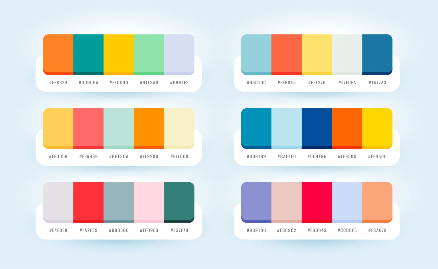
Best Tools for Creating Website Colour Palettes
Thankfully, you don’t need to be a designer to build a beautiful palette. These tools can help you experiment and find combinations that fit your brand:
- Coolors.co – Generates automatic colour schemes and allows easy customisation.
- Adobe Color Wheel – Experiment with analog, complementary, or triad combinations.
- Canva Colour Palette Generator – Create palettes from uploaded images, such as your logo or product photos.
- Paletton – Great for testing contrast and previewing how colours interact on-screen.
These tools not only speed up the design process but also ensure that your palette feels cohesive and professional.
Website Colour Palette Examples (by Industry)
Here are a few examples to help you visualise how different industries use colour strategically:
- Corporate Website: Navy Blue, Grey, White → communicates trust and authority.
- Wellness or Spa Website: Sage Green, Beige, Soft White → creates calm and relaxation.
- E-commerce or Fashion: Black, Gold, Cream → evokes luxury and sophistication.
- Tech Startup: Blue, Teal, White → feels modern, innovative, and reliable.
Choosing colours that align with your industry helps position your brand correctly in the minds of potential clients or customers.
Common Mistakes When Choosing Website Colours
Even the most creative websites can fail if colour choices are poorly executed. Avoid these common pitfalls:
- Using too many colours: This creates visual clutter and confuses users.
- Poor contrast: Makes text hard to read, especially for users with visual impairments.
- Ignoring accessibility guidelines: Can alienate a portion of your audience.
- Inconsistent branding: Leads to a lack of recognition and trust.
The goal is cohesion, not chaos — your colour palette should work together to guide users, not distract them.
Conclusion: Build a Colour Palette That Reflects Your Brand
Your website’s colour palette is one of the most powerful tools in digital design. The right colours can inspire emotion, strengthen brand identity, and boost conversions.
When chosen with strategy and purpose, colour turns your website into an engaging, memorable experience for users. So, take the time to experiment, test, and refine your palette — and most importantly, keep it true to your brand’s personality.
If you’re ready to create a website that truly reflects your brand, Absolute Websites can help. Our expert design team blends creativity with strategy to build websites that not only look stunning but also drive real business results.