Mobile devices are now the main way people browse the internet. From shopping and reading content to booking services and contacting businesses, users expect websites to work perfectly on their phones.
In 2026, having a mobile-friendly website is no longer optional. A business that does not invest in mobile responsiveness risks losing traffic, rankings, and customers.
A strong mobile responsive website design improves user experience, supports SEO, and helps increase conversions. This guide explains why mobile responsiveness matters and how businesses can improve their websites for modern users.
What’s Included in this Article
This article explains the importance of mobile responsiveness in 2026. You will learn what mobile responsive design means, why it matters for SEO and conversions, and how to improve your website for mobile users. It also covers key features every mobile-friendly website should include.
People Use Their Mobile Devices More Than Ever
Mobile usage continues to grow every year. Most users now browse websites, shop online, and search for services directly from their smartphones.
People expect websites to load quickly and work smoothly on smaller screens. If a website is difficult to use on mobile, users often leave within seconds.
Common mobile browsing activities include:
- Searching for local businesses
- Shopping online
- Reading articles and blogs
- Watching videos
- Booking appointments or services
Because mobile traffic is so high, businesses must focus on creating a smooth mobile experience.
What is Mobile Responsive Design?
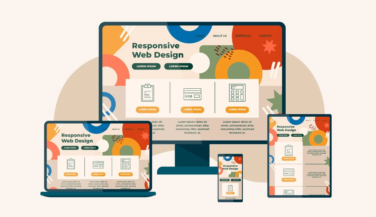
Mobile responsive design is a web design approach that allows a website to adapt to different screen sizes automatically.
A responsive website changes its layout, images, and content structure depending on the device being used. This ensures the website looks good and functions properly on:
- Smartphones
- Tablets
- Laptops
- Desktop computers
Instead of creating separate mobile and desktop websites, responsive design uses flexible layouts and responsive elements to provide one consistent experience.
A properly designed mobile responsive website design improves usability and accessibility for all users.
Why Mobile Responsive Design Matters in 2026
Mobile responsiveness affects nearly every part of your online success, from SEO rankings to conversions.
1. Google’s Mobile-First Indexing and SEO
Google now uses mobile-first indexing. This means Google mainly looks at the mobile version of your website when deciding rankings.
If your mobile website performs poorly, your rankings may drop even if your desktop version looks good.
A mobile responsive website helps improve:
- Search visibility
- User engagement
- Crawlability and indexing
Responsive design also reduces duplicate content problems because you only maintain one version of your website.
2. The Growth of Mobile Search and User Expectations
Mobile searches continue to increase. Users now expect websites to:
- Load quickly
- Be easy to navigate
- Display correctly on all devices
Modern users have little patience for slow or poorly designed websites. If users struggle to interact with your content, they are likely to leave and visit a competitor instead.
Meeting user expectations is critical for keeping visitors engaged.
3. Improved User Experience (UX) and Higher Conversions
User experience is one of the biggest benefits of responsive design.
A mobile-friendly website makes it easier for users to:
- Read content
- Click buttons
- Fill out forms
- Browse products or services
When users have a positive experience, they are more likely to take action. This leads to:
- More enquiries
- Higher sales
- Better conversion rates
Good UX also helps reduce bounce rates and increases time spent on the website.
4. Increased Page Speed and Performance
Website speed is especially important on mobile devices. Many users browse using mobile data, which can be slower than desktop internet connections.
A responsive website is designed to load efficiently on smaller devices. Faster loading speeds improve:
- User satisfaction
- SEO performance
- Conversion rates
Slow websites frustrate users and often lead to lost business opportunities.
How to Improve Mobile Responsive Design in 2026
Improving mobile responsiveness requires more than simply shrinking a desktop website. Businesses must focus on usability, performance, and accessibility.
1. Prioritize a Mobile-Friendly User Interface (UI)
Your mobile interface should be simple and easy to use.
Important UI improvements include:
- Large clickable buttons
- Clear menus
- Proper spacing between elements
- Easy scrolling
Avoid cluttered layouts and too much text on one screen. Users should be able to navigate your website comfortably with one hand.
A clean mobile interface improves usability and keeps users engaged longer.
2. Optimize for Mobile SEO and Voice Search
Mobile SEO is essential for visibility in search engines.
To improve mobile SEO:
- Use responsive design
- Optimize page titles and meta descriptions
- Improve internal linking
- Compress images for faster loading
Voice search is also becoming more common. Many users now search by speaking into their devices.
To optimize for voice search:
- Use natural language
- Answer common questions clearly
- Focus on conversational keywords
This helps your content appear in voice search results.
3. Enhance Website Speed and Performance
Performance optimisation is critical for mobile users.
Ways to improve speed include:
- Compressing images
- Reducing unnecessary scripts
- Using browser caching
- Choosing reliable hosting
You should also regularly test your website speed using performance tools. Even small speed improvements can significantly increase conversions.
4. Improve Accessibility and Readability
A responsive website should be easy for everyone to use.
To improve accessibility:
- Use readable font sizes
- Maintain strong colour contrast
- Add alt text to images
- Ensure buttons are easy to tap
Readable content is also important. Keep paragraphs short and use headings to break up information.
This improves both user experience and content engagement.
5. Leverage Mobile Conversion Strategies
Your mobile website should guide users toward action. Effective mobile conversion strategies include:
- Sticky call-to-action buttons
- Simplified forms
- Click-to-call buttons
- Easy checkout processes
Mobile users often want fast results. Removing unnecessary steps helps improve conversions.
Essential Features a Mobile Responsive Website Should Have
A modern responsive website should include features that improve both usability and performance.
Important features include:
- Responsive layouts that adapt to all screen sizes
- Fast loading speeds
- Mobile-friendly navigation menus
- Optimized images and videos
- Clear calls to action
- Readable typography
- Secure HTTPS connection
- Touch-friendly design elements
These features create a smoother experience for users and improve SEO performance.
Conclusion
Mobile responsiveness is now a core part of successful web design. Businesses that ignore mobile users risk losing traffic, rankings, and customers.
In 2026, users expect websites to be fast, simple, and easy to use on every device. A strong mobile responsive website design improves user experience, supports SEO, and increases conversions.
By following modern mobile design best practices, businesses can create websites that perform better and deliver stronger results.
At Absolute Websites, we create modern mobile responsive website design solutions that improve SEO, user experience, and conversions. From speed optimisation to mobile-first design, we help businesses build websites that perform on every device.
Key Takeaways
Mobile responsiveness is essential for SEO and user experience.
Google uses mobile-first indexing for rankings.
Responsive websites improve conversions and engagement.
Fast loading speed is critical for mobile users.
Accessibility and readability improve usability.
Mobile-friendly design helps businesses stay competitive in 2026.